Create custom components
Learn about Parcel components, a powerful way to organize your email code.
If you started using Parcel after April 12, 2024, you're already set up to create our latest, custom components! Otherwise, check out the differences between our legacy and latest implementation to see if you're ready to upgrade.
Custom components are a way to organize your code into reusable blocks. Unlike snippets, when you change the component file, it will change in all places it has been used.
To get the most out of custom components, check out our Visual editor overview. How you create a component directly affects how you and your team can modify components in the visual editor.
You can create a custom component from your dashboard when no file is open:
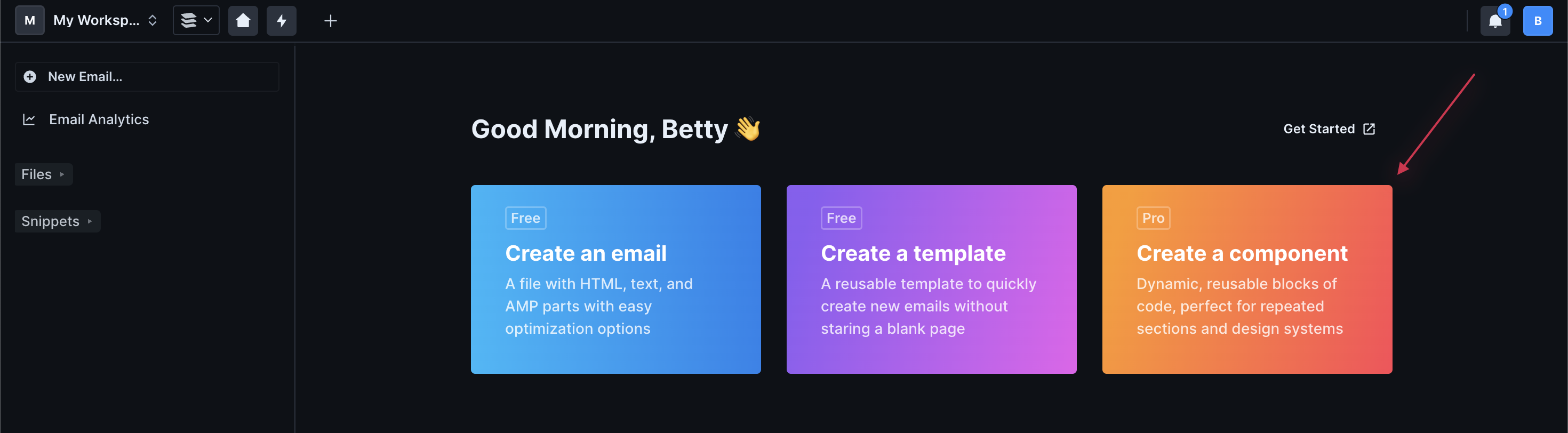
From Files:
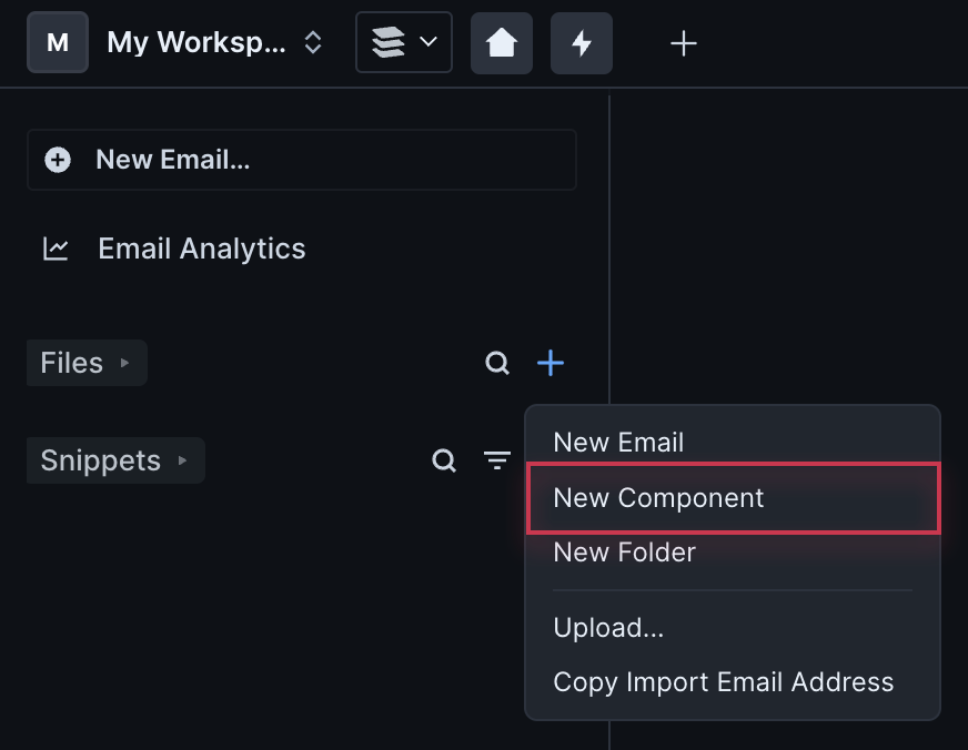
Or by searching in the Command Palette:
The name you give the file will become the Component Name (removed of spaces), which you'll use to insert your component into your messages. You can change this at any time at the top of your component file.
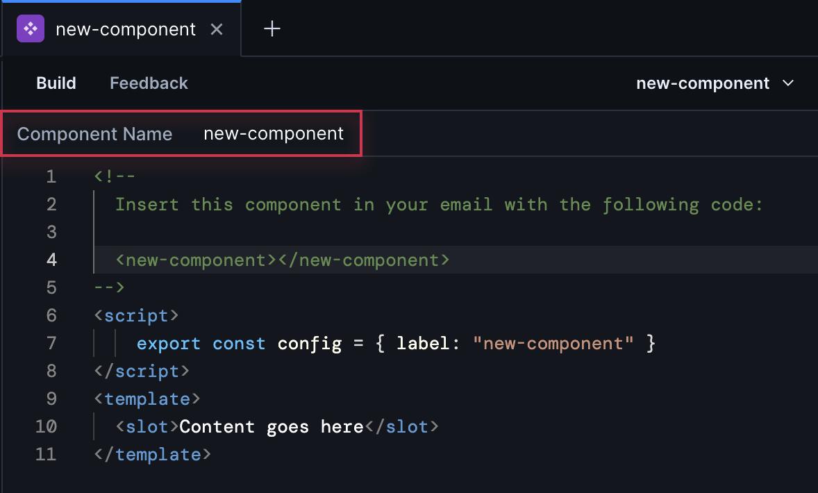
There are two required tags when setting up a component: <script> and <template>. The <script> tag is where you set properties, slots, and other Javascript logic. The <template> tag is where you create your content and reference variables and slots.
When you create a component from scratch in Parcel, this is the starting code we provide:
In the script, config gives the component a label by setting "label": "my-paragraph",.
You can make the label different from the component name, but we recommend you keep them similar. The component name is used in the code, which comes with some restrictions like no spaces. The label appears in the visual editor and comes with fewer restrictions if you want a more user-friendly name there.
There are four other tags you can include in your top-level elements, as well:
<style>- where you establish the style of the component; you can render variables created in the<script>tag<title>- use this to insert a title element into the<head>of the email<link>- use this to insert a link element into the<head>of the email<meta>- use this to insert a meta element into the<head>of the email
If you're creating a component that should be the same from message-to-message, you can add HTML directly to the <template> tag. For instance, maybe you're making a footer that should be static across all your emails. On the other hand, perhaps you want to create a component with placeholder content that you add to any message then your team can modify the placeholder to be different from message-to-message. If that's the case, add a slot!
Once you have the basic component, you can add placeholder text that your team can modify in any message the component is inserted in. This is done through slots. You'll define your slots in the <script> tag and insert <slot> tags in the <template> tag where you want your team to create different text from message-to-message.
In the <script> tag above, we added:
This defines the slot and will export it for use in the visual editor. In this example, we're only adding one slot, so we don’t need to name it. We’ll just use the default name that is default.
Inside the slot script, we need to say what type of slot this is. We're using this one for text, so we added schema: Component.slots.text(),. When using text slots, you can also optionally allow a set of marks to be applied. This will give your team some pop-up options when they highlight text in the visual editor.
Now, move down to the <template> tag of our example. This is where you add the <slot> element. In this example, I added some text as placeholder. This will show as default in messages until your team changes it.
After you insert the component in a message, you can edit the slot directly in the code editor.
In the visual editor, click the slot (note the name will match the label you set in the <script> tag) then edit the text.
The next step in enhancing the component is to add properties. These properties allow for a lot more customization of the component. Here we’ll add some text styling.
First, we need to define our properties in a similar way to how we defined our slot by using export const props = Component.defineProps({}).
We’re adding three properties here: color, font-size and text-align. Each has a number of additional settings. These are all optional, but we recommend you set some of these to help improve the user experience in the visual editor.
After you set your properties, you'll create another object to help build the component and pass styles to your message. Here we'll call it the styleObject, but you can name this anything you like. Then, when you add a style attribute to your template, we will automatically pass this Javascript object to output your styles.
The names on the left are the CSS attributes you want to include, and on the right are the values. If a property is not set, it will have a value of undefined and will not be included in the output code. You can also include hard-coded styles which aren’t included in the props, like line-height in the example above.
To add this to our component, let's set the style of the paragraph tag: <p #set:style="styleObject">.